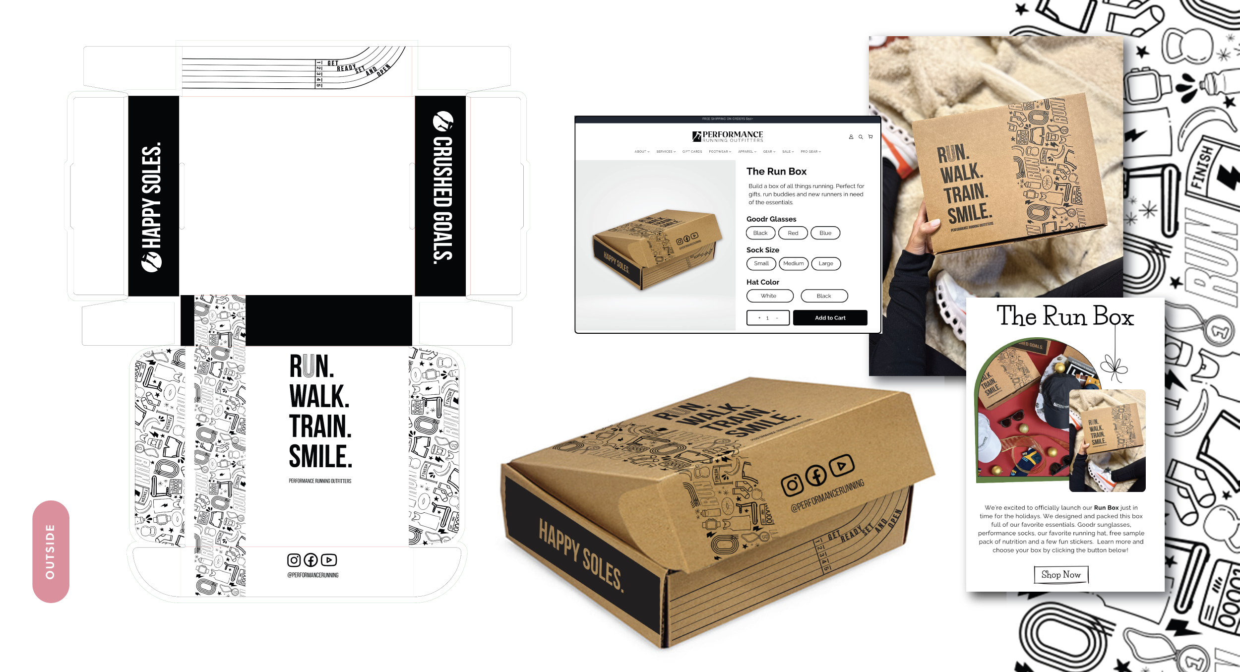
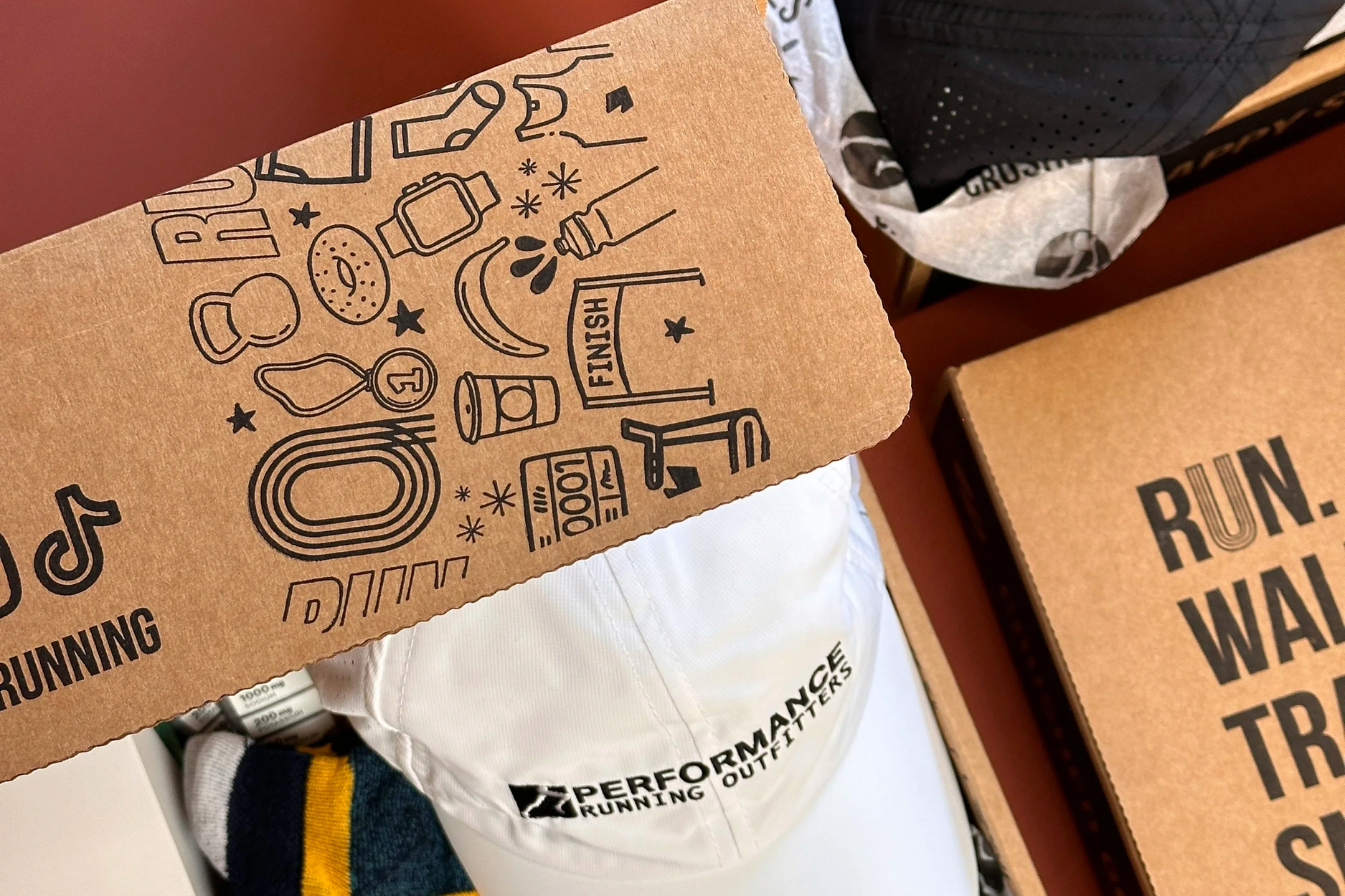
Packaging Design
Interactive Packaging
A QR code integrated into the packaging invited consumers to engage beyond the product, connecting them directly to featured Picky Bars athletes who shared their personal journeys, training insights, and motivation. In an increasingly saturated energy bar market, this approach created a meaningful human connection, grounding the brand in real stories of young athletes pursuing their goals and fostering long-term trust and loyalty.
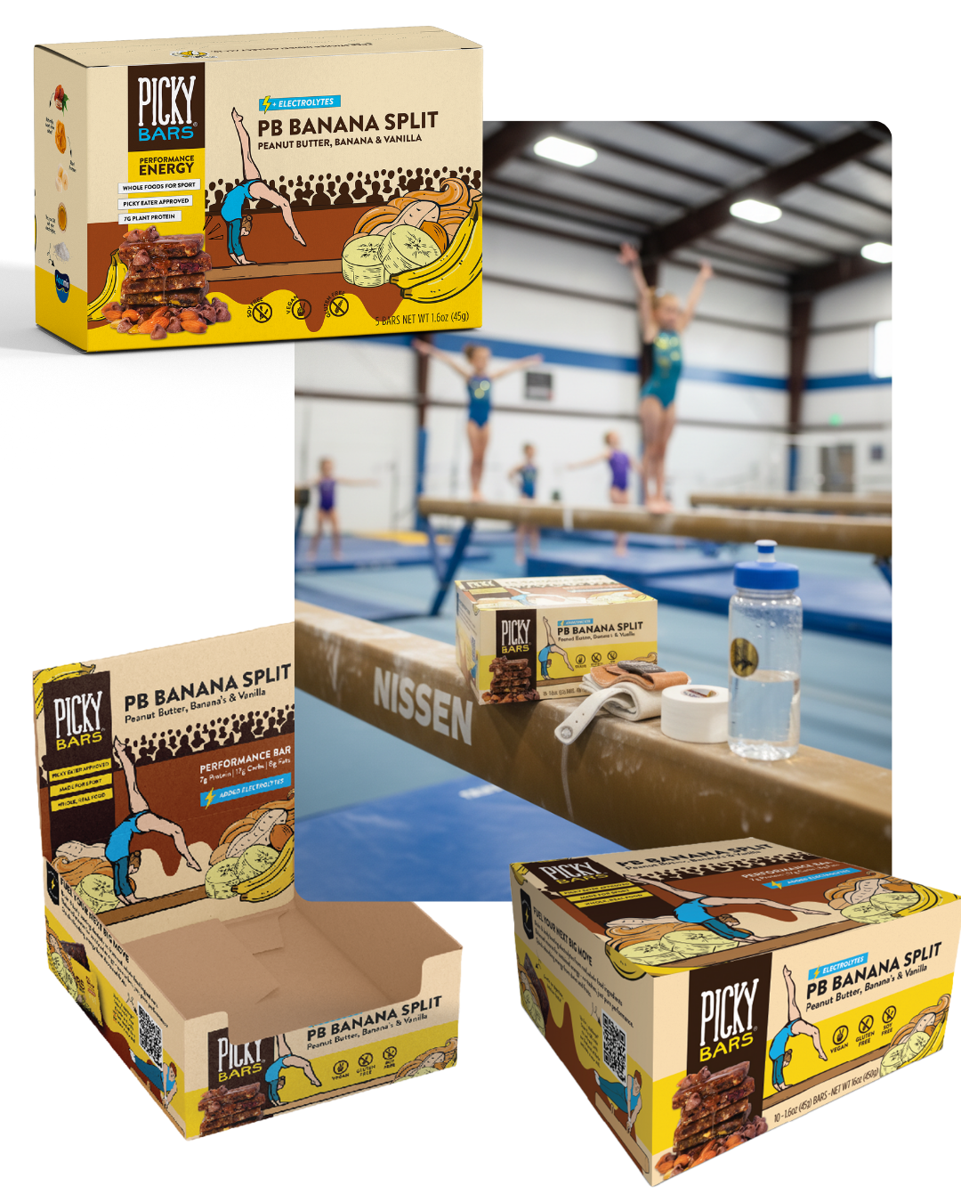
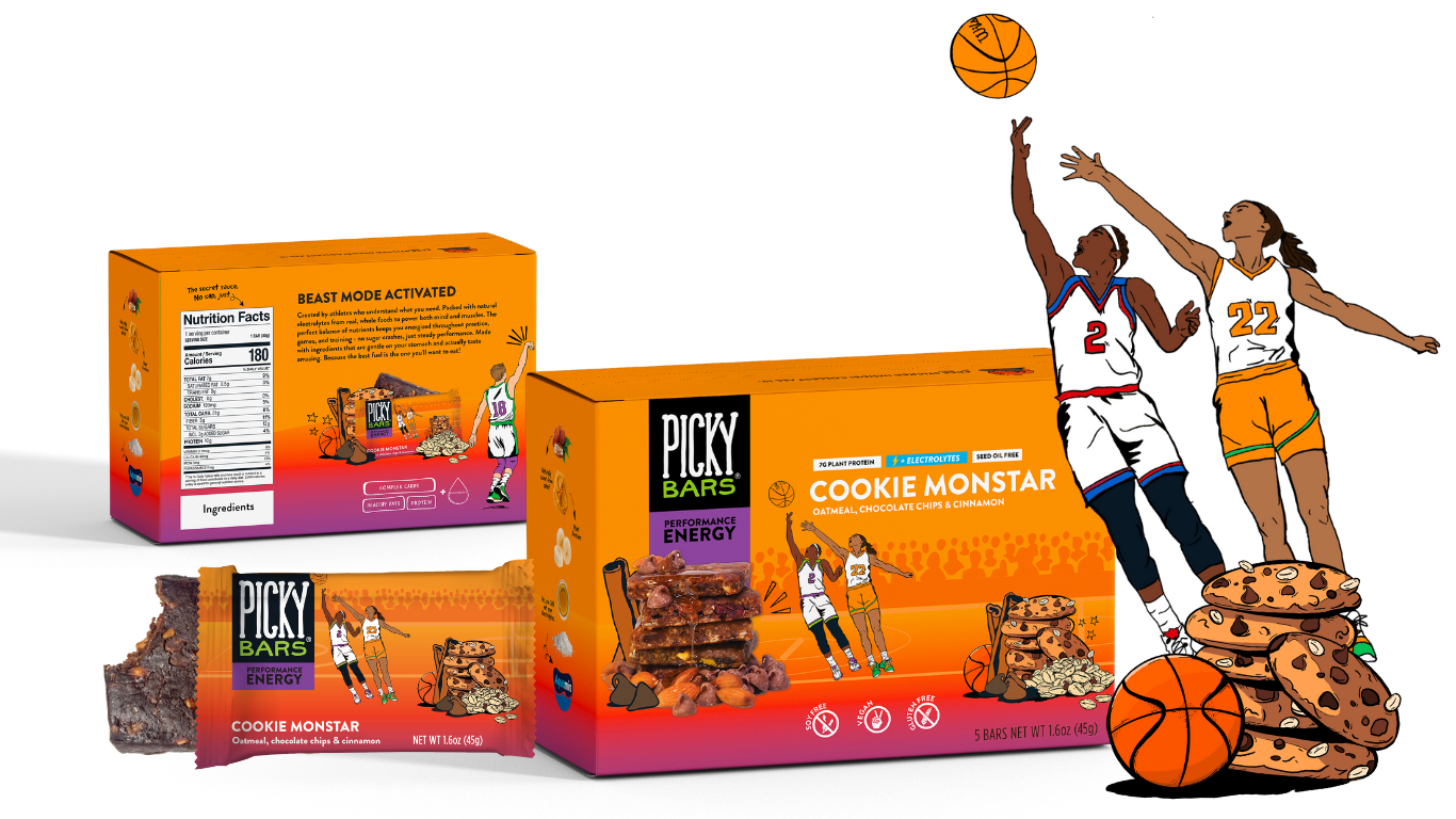
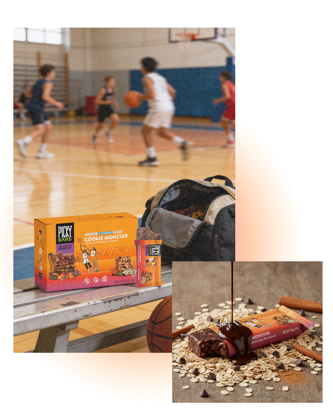
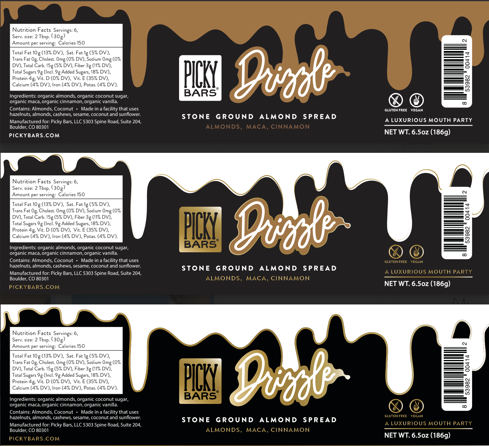
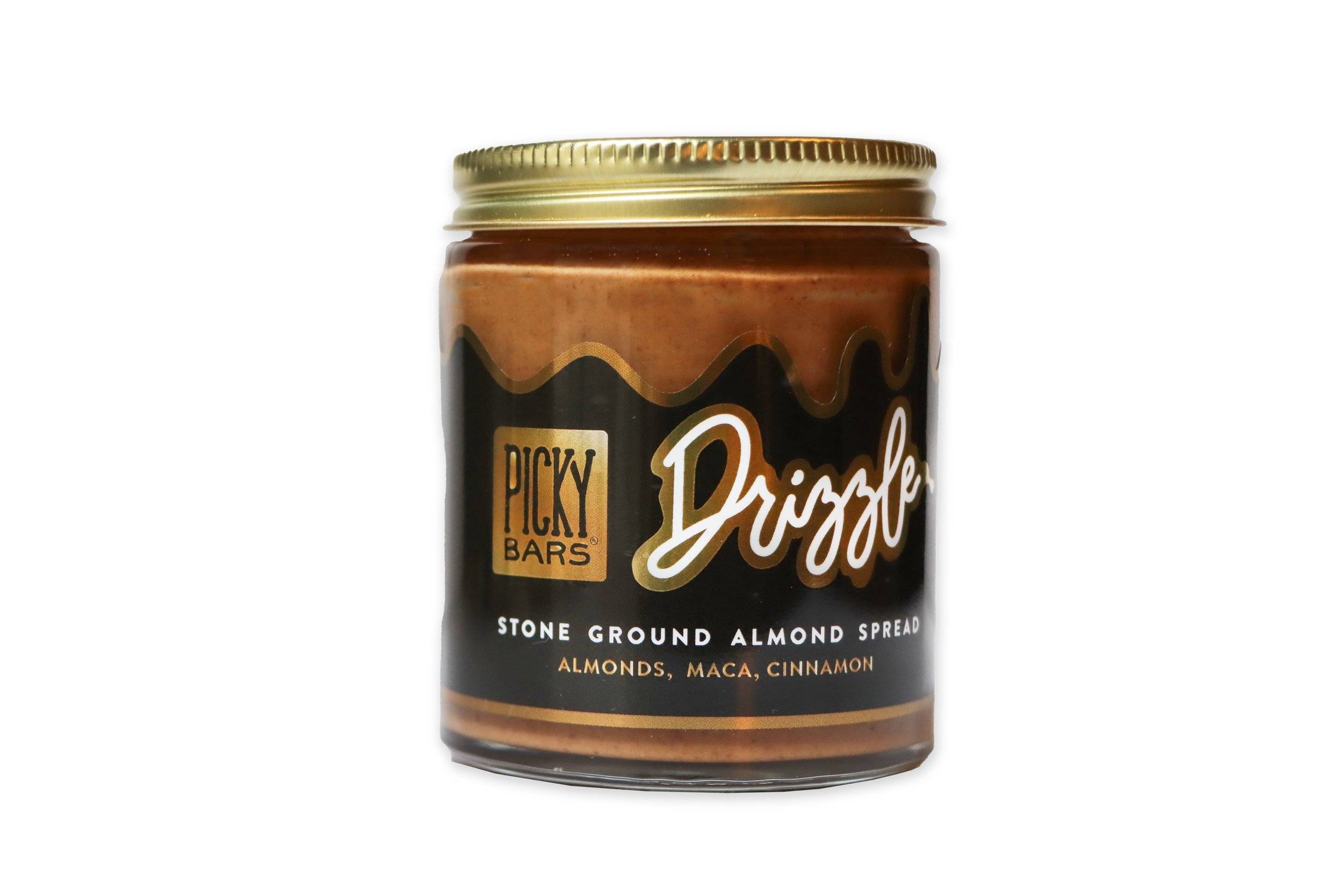
Illustration as a Competitive Advantage
In a category dominated by minimal copy and flat design, I introduced hand-drawn illustration to bring personality and warmth back to packaging. Illustrated athletes and ingredients were blended with real photography and graphic textures, creating a mixed-media system that elevated flavor storytelling and visual impact, helping the product stand out instantly on shelf.
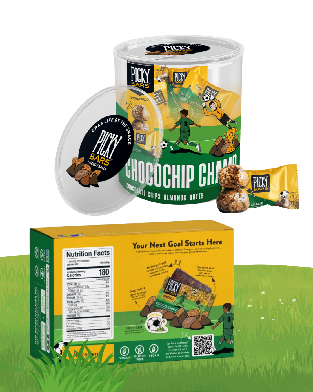
Thinking outside of the bar…
To stand out in a crowded category and earn shelf space at major retailers, I set out to rethink not just how energy bars are packaged, but how they’re experienced. This concept pushed “thinking outside the box” quite literally, replacing traditional wrappers with a reusable container and transforming bars into bite-sized balls designed for instant, on-the-go fueling. The innovation extended beyond form: the formulation was reimagined to include a meaningful source of electrolytes, reinforcing the idea that performance nutrition can support hydration as well as energy. A holistic rethink of product, packaging, and purpose, designed with athletes at the center.
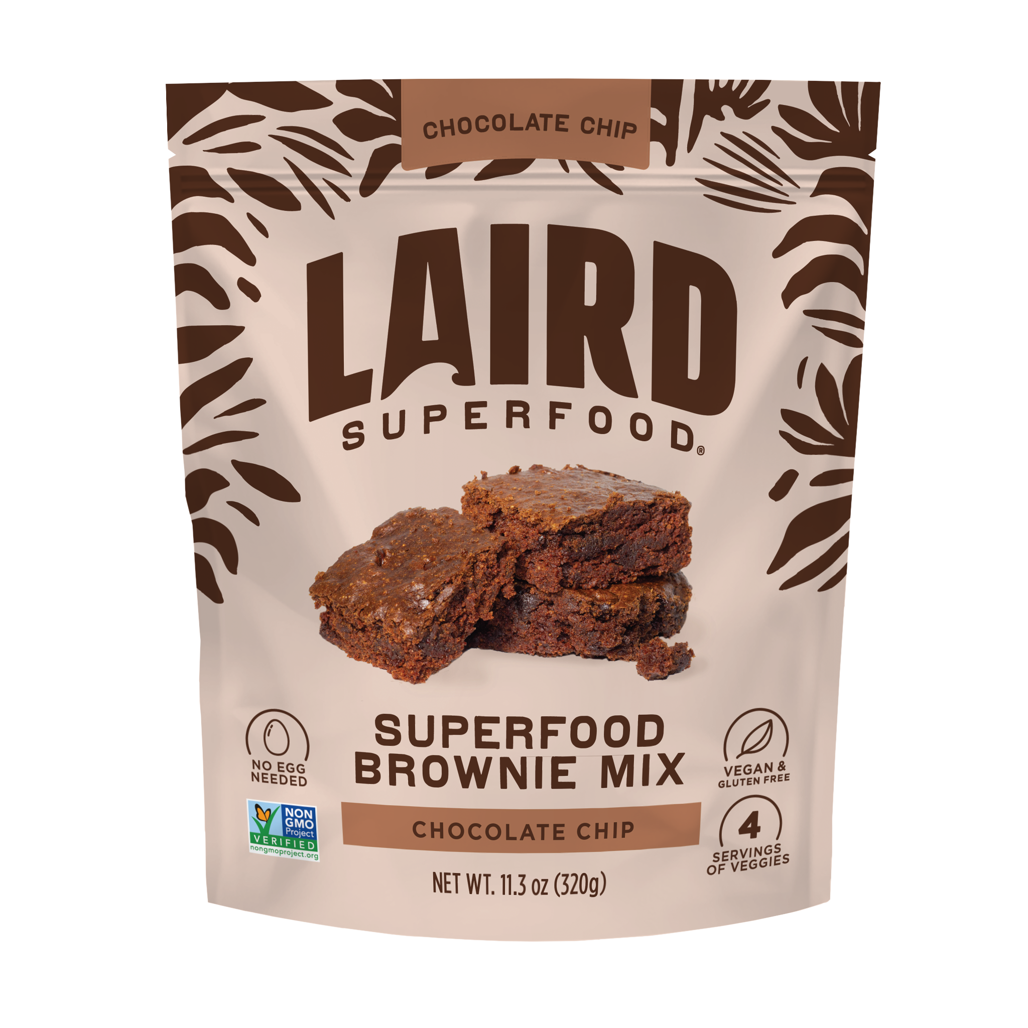
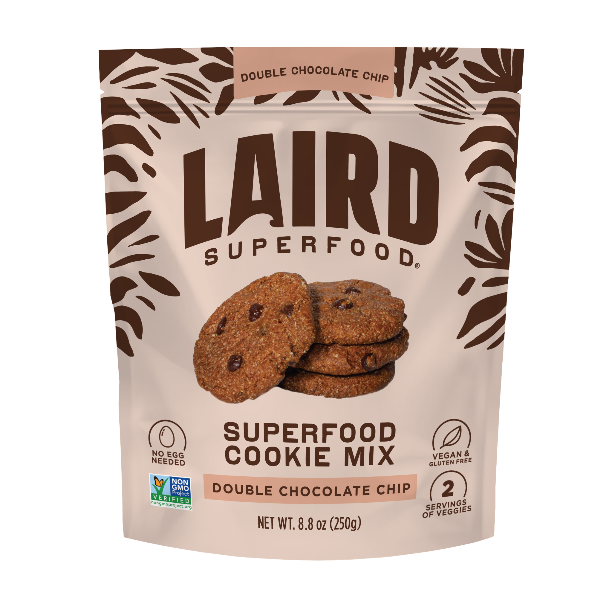
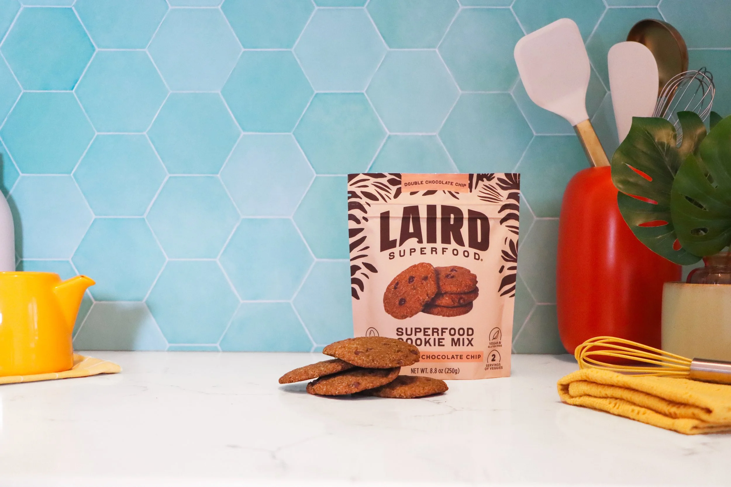
Baking Mixes
Packaging Design & Photography